

You spend an hour getting your developer profile right — the projects, the GitHub stats, the resume link. You paste it into a tweet or a Slack channel. And it shows up as a bare blue link, or a random screenshot, or your logo on a white square that says nothing.
A developer profile social preview image (also called an Open Graph image) is the picture that appears when your profile link is pasted into X, LinkedIn, Slack, or Discord. Without one, platforms either scrape a random image from your page or show no image at all. The fix is a 1200×630 image referenced by an og:image meta tag — ideally one that's generated from real, current data instead of a static photo you uploaded once and forgot about.
This matters more than it used to. Developers are shipping in public more than ever, and every one of those shares lives or dies in the half-second before someone decides whether to tap. If your card is blank, you've already lost the click — before anyone reads a word you wrote. And if it's a screenshot you exported six months ago, you've done something worse than blank: you're broadcasting a number that stopped being true, to everyone who sees the link and never opens it.
On this page: What it is · The spec sheet · Why screenshots fail · Proof-in-Preview · Build it yourself · Three approaches · Testing and debugging · The checklist · FAQ
What a Developer Profile Social Preview Image Actually Is (and Why Most Links Look Broken)#
Every major platform — X, LinkedIn, Slack, Discord, iMessage, WhatsApp — runs a bot that fetches your page's HTML the instant a link is pasted. That bot reads a handful of <meta> tags in your <head>: og:title, og:description, og:image, and for X specifically, twitter:card and twitter:image. Whatever those tags say is what gets rendered in the preview card. Not what's actually on your page — what the tags claim is on your page.
Three things break this in practice:
No
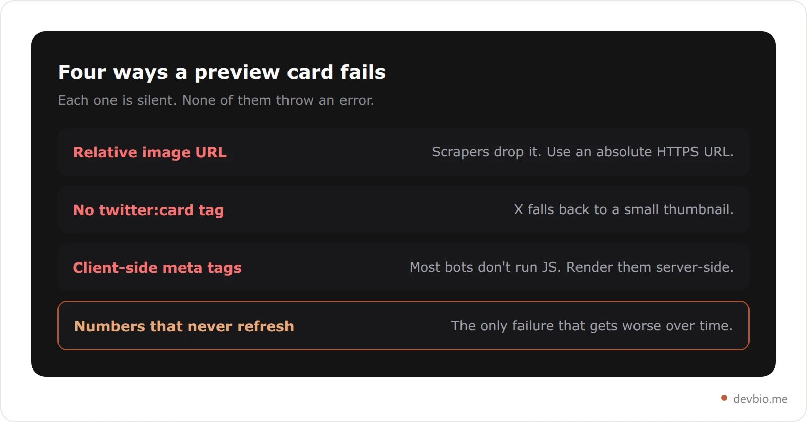
**og:image**tag at all. The platform either falls back to scraping the first<img>it finds (often your favicon or an unrelated asset) or shows nothing.A relative URL.
/images/og.jpginstead ofhttps://yoursite.com/images/og.jpg. Scrapers need an absolute URL; a relative one gets silently dropped.Aggressive caching. Platforms cache the scraped image for days or weeks. Update your image without busting the cache and nobody sees the new version.
The payoff for getting it right is not marginal. Links with a custom Open Graph image get roughly 2 to 5 times more engagement than links without one, and pages with rich, working previews see about 45% higher engagement than those with basic or broken ones. Over 60% of social media users say they're more likely to click a link that includes a visual preview at all. For a developer profile — a link whose entire job is to get clicked — that's not a nice-to-have.

Your profile can carry that same proof automatically — connect GitHub and a payment provider once, and every share inherits a card that's still true tomorrow.
The Spec Sheet: Dimensions, File Size, and Meta Tags for Every Platform#
Every platform wants roughly the same image, with small variations that matter if you're chasing pixel-perfect rendering:
Platform | Recommended Size | Aspect Ratio | Max File Size | Notes |
|---|---|---|---|---|
Facebook, LinkedIn, Slack, Discord | 1200×630px | 1.91:1 | Under 1MB | Keep text/faces inside the center 1080×600 safe zone |
X (summary_large_image) | 1200×675px | 16:9 | Under 5MB | Crops top/bottom on mobile; min 300×157, max 4096×4096 |
WhatsApp, iMessage | 1200×630px | 1.91:1 | Under 300KB | Same tag, but heavier files render slow or get skipped |
Generic fallback | 1200×630px | 1.91:1 | Under 1MB | Safe default if you're only shipping one image |
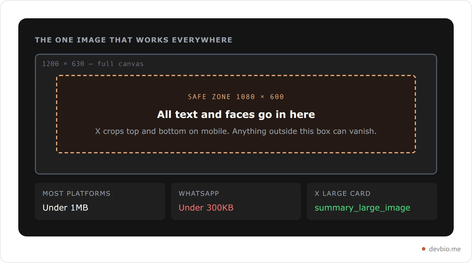
You technically only need one image. 1200×630 satisfies every platform's minimum and renders acceptably even where the "ideal" ratio differs slightly. For the full per-platform breakdown — including GitHub's separate 1280×640 repository preview, the file-size limits chat apps quietly enforce, and the scraper timeout that kills correctly-sized dynamic cards — see our OG image size spec. Getting the twitter card on a developer profile right starts with one line: set twitter:card to summary_large_image so X uses the big card instead of a small thumbnail — the single most-skipped step in most setups.
Two tags do the heavy lifting:
<meta property="og:image" content="https://yoursite.com/api/og?user=you" />
<meta property="og:image:width" content="1200" />
<meta property="og:image:height" content="630" />
<meta name="twitter:card" content="summary_large_image" />
Declaring width and height isn't required, but it saves the scraper a round trip and avoids a layout flash on platforms that render the card progressively.
Why a Static Screenshot Is the Wrong Default#
Here's the part most guides skip: the safest, most common choice — a professional headshot or a one-time screenshot as your OG image — is also the weakest one available to a developer.
A static image can't tell the truth for long. The screenshot you took in March shows the MRR number from March. The headshot shows your face, which nobody needed convincing of. Neither one does the actual job of a preview: giving a stranger a reason, in under a second, to believe there's something worth clicking through for.
Worse, a stale "proof" image is worse than no image at all, because it's quietly lying. A dashboard screenshot showing $1,200 MRR that's now actually $4,800 undersells you. One showing 40 GitHub stars when you're at 400 makes your profile look abandoned. You'd be better off with no image than an outdated one — at least a blank card doesn't actively misrepresent you.
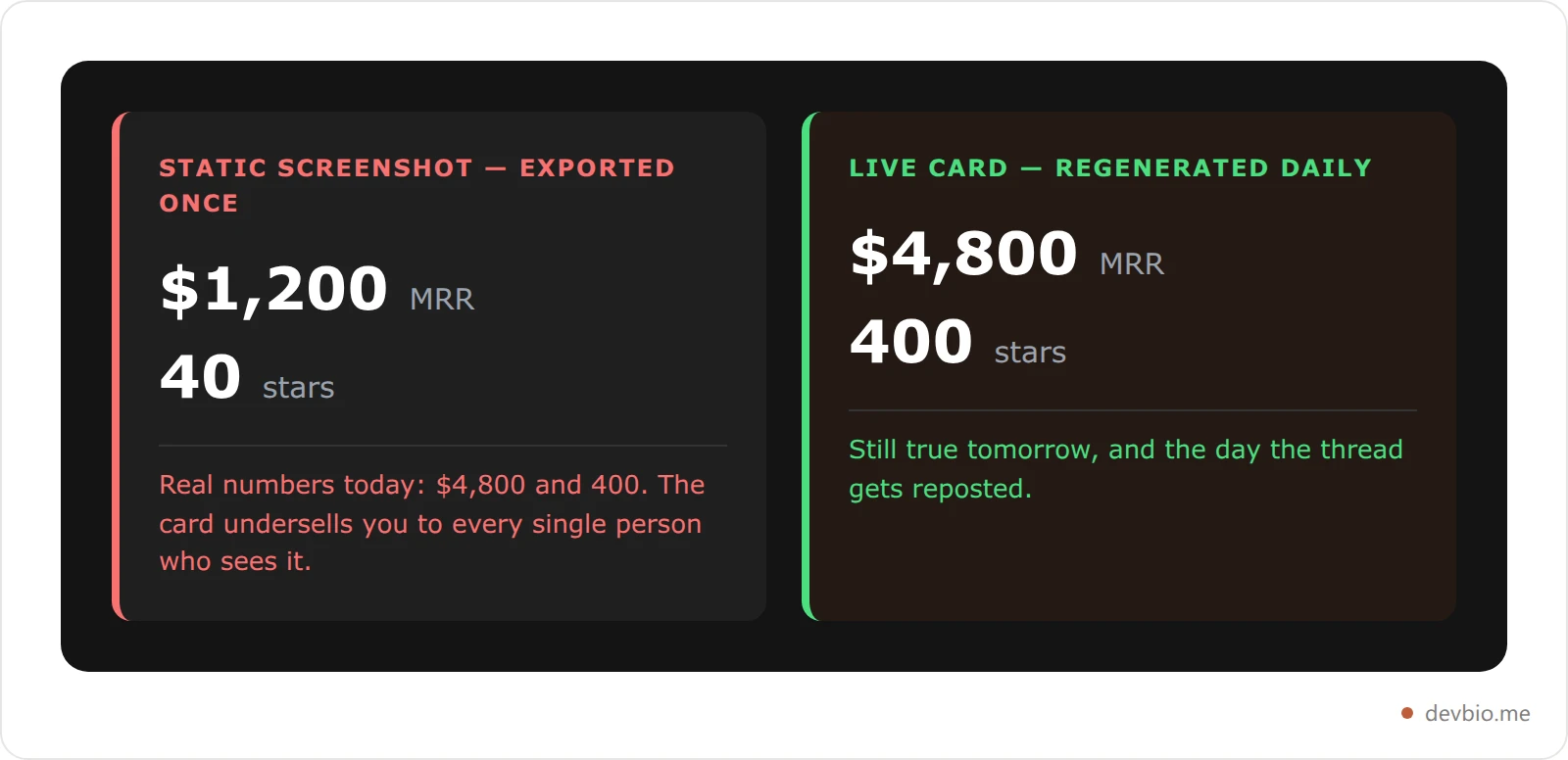
This is why the fix isn't "add an image." It's "add an image that's still true tomorrow."
The Proof-in-Preview Principle#
Call it the Proof-in-Preview principle: a developer profile social preview should carry the same job as the first fold of your profile, compressed into one image — your name, your one-line role, and two to four numbers that are true right now. Not a photo. Not a logo. Numbers.
For a developer, that means GitHub stars, commits this year, MRR, or subscriber count — whichever of those you actually have and are willing to show. The card becomes a claim with receipts, visible before anyone even opens the link — the same proof-over-claims logic that should run through the rest of your profile.
This matters more as the signal-to-noise ratio gets worse. GitHub added more than 36 million new developers in the past year alone — over one every second — and now hosts 180 million-plus accounts and 630 million repositories. Everyone has a profile. Almost nobody's profile proves anything at a glance. Separately, in surveys of hiring managers, 44% say they've hired someone specifically because of strong personal-branding signals, and 54% say they've rejected a candidate over a weak or absent one. The preview card is the fastest branding signal you have, because it's the one people see before they've decided to invest any attention at all.
As developer and DevRel writer swyx put it when explaining why he bothers generating unique Open Graph images for every post on his site: "A picture is worth a thousand words, and in today's attention spans and media, they may present the only glance people give to your work before moving on to the next thing." That's true of a blog post. It's more true of a profile link competing with a hundred other tabs.
How to Build a Live Data Card Yourself#
If you're running your own Next.js site, next/og (built on Vercel's Satori renderer) turns JSX and a subset of CSS into a PNG at request time. The pattern looks like this:
// app/[username]/opengraph-image.tsx
import { ImageResponse } from 'next/og'

export const size = { width: 1200, height: 630 }
export const contentType = 'image/png'
export const revalidate = 86400 // regenerate at most once a day

export default async function Image({ params }) {
  const profile = await getProfileKpis(params.username) // name, tagline, stars, mrr...

  return new ImageResponse(
    (
      <div style={{
        display: 'flex', flexDirection: 'column',
        width: '100%', height: '100%',
        background: '#0a0a0a', color: '#fff', padding: 64,
      }}>
        <div style={{ fontSize: 56, fontWeight: 700 }}>{profile.name}</div>
        <div style={{ fontSize: 28, opacity: 0.7 }}>{profile.tagline}</div>
        <div style={{ display: 'flex', gap: 24, marginTop: 'auto' }}>
          {profile.kpis.map((kpi) => (
            <div key={kpi.label} style={{ display: 'flex', flexDirection: 'column' }}>
              <div style={{ fontSize: 40, fontWeight: 700 }}>{kpi.value}</div>
              <div style={{ fontSize: 18, opacity: 0.6 }}>{kpi.label}</div>
            </div>
          ))}
        </div>
      </div>
    ),
    size,
  )
}
Two details make this production-ready instead of a toy: a revalidate window so you're not regenerating the image (and hammering your GitHub/Stripe API calls) on every single share, and a fallback branch for profile.kpis when someone hasn't connected GitHub or a payment provider yet — show skill tags instead of blank space, never an empty tile. next/og caps the whole render at a 500KB bundle, so keep fonts and images light, and remember only flexbox layouts are supported — no CSS grid.
This is close to how DevBio's own profile pages generate their card: a dark founder-card layout that pulls name, tagline, avatar, and top skills, then adds up to four live tiles — MRR, subscribers, GitHub stars, commits — sourced straight from your connected Stripe, Dodo Payments, Lemon Squeezy, or Polar account and your GitHub stats. Bios without a revenue or GitHub connection fall back to skill chips, so the card never renders empty. It's cached with a daily revalidation window, so a share on day three of a viral thread still shows numbers from that morning, not from signup day.
Skip building this yourself — see how a DevBio profile card works.
DIY vs. Generic Tools vs. a Live Data Card#
Three routes get you a working social preview — including reaching for a generic og image generator. They are not equally good at staying honest:
Approach | Setup Effort | Stays Current? | Shows Real Proof? | Best For |
|---|---|---|---|---|
Static image (Canva/Figma export) | Low | No — manual re-upload every time something changes | No, design only | A one-off landing page |
Generic OG tool (template generators) | Low–Medium | Rarely — most are template-based with no live data binding | No, decorative | Marketing pages, blog headers |
Custom | Medium–High, ongoing dev time | Yes, if you wire it to real data | Yes, if you pull it yourself | Developers who want full control |
DevBio profile (built-in live card) | None — automatic | Yes, daily refresh, no maintenance | Yes — GitHub stars/commits, MRR from Stripe, Dodo Payments, Lemon Squeezy, or Polar | Developers who want proof without building it |
The middle two options are where most profiles land by default, and they're also where the Proof-in-Preview principle breaks down — a nice-looking card that doesn't update is just a slower-to-notice version of the stale-screenshot problem.
Get the automatic version — no code, no cron job, no forgetting to update it.
What Changes When Your Preview Shows Proof#
Picture two identical developer profiles, shared in the same build-in-public thread on the same day, differing in nothing but the developer profile social preview attached to each. Profile A has no og:image tag at all, so X falls back to a text-only card — just a headline and a domain name. Profile B's preview is a dark card that reads "2.4k GitHub stars" and "$3,100 MRR" next to the founder's name.
Nothing else about the two tweets is different — same follower count, same posting time, same caption. But the engagement math from earlier in this piece isn't abstract: custom Open Graph images drive roughly 2 to 5 times more engagement than none, and rich previews close something like a 45% engagement gap versus broken or missing ones. Applied to this pair, Profile B's tweet should reasonably clear two to three times the click-through of Profile A's — not because the writing is better, but because the preview gave people a reason to stop scrolling before they'd even read the caption.
That gap compounds. A build-in-public post gets quote-tweeted, reposted into a newsletter roundup, pasted into a Slack channel by someone else entirely. Every one of those secondary shares inherits whatever card you shipped. A stale or missing image doesn't just cost the first click — it costs every click downstream of it, for as long as that link keeps circulating.
How to Test and Debug Your Preview Before You Post#
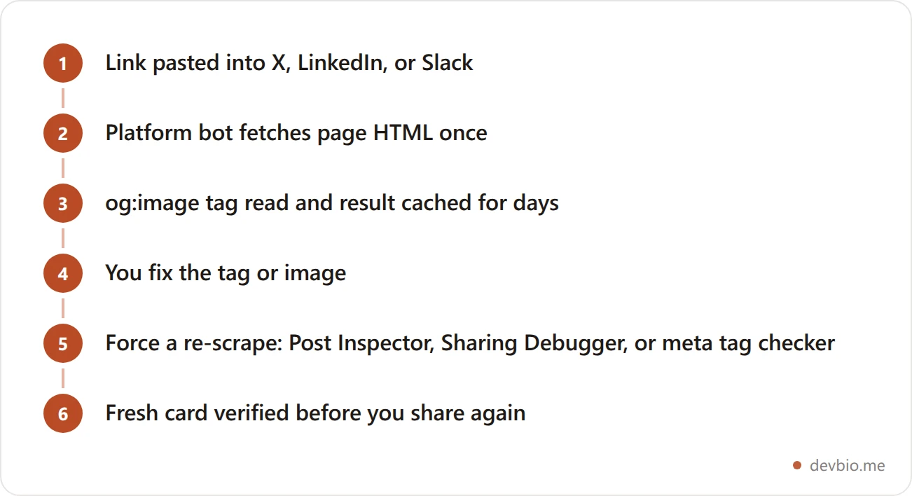
Cached previews are the most common reason a fix doesn't seem to work. Platforms scrape once and hold onto the result for days, so after you change your og:image, you need to force a re-scrape, not just reload the page:
LinkedIn Post Inspector — paste your URL, it shows exactly what LinkedIn will render and forces a re-crawl.
Facebook Sharing Debugger — same idea for Facebook and, by extension, most Meta-owned surfaces.
X's Card Validator — has been unreliable since 2023; when it's gated behind login you don't have, third-party checkers like socialsharepreview.com or opengraph.xyz fetch your tags directly and render a preview without needing X's own tool.
curl your own tags —
curl -s https://yoursite.com | grep og:imageconfirms the tag is actually in the server-rendered HTML, not injected client-side after the scraper's already given up (most social bots don't run JavaScript).A meta tag checker — a dedicated meta tags checker pulls every og: and twitter: tag on a URL in one pass, which is faster than reading raw HTML when you're debugging more than one tag at once.
If you're building a live MRR display into your profile already, the same live-data mindset should extend to the preview card — otherwise you've built a profile that proves things and a preview that doesn't.
The Copyable OG Image Checklist#
Save this and run it before every share of a new or redesigned profile:
og:imagetag present, pointing to a full absolute HTTPS URL — not a relative pathImage is 1200×630px (or 1200×675 if you're optimizing specifically for X), under 1MB
og:titleandog:descriptionare set uniquely — not copied from your homepage defaultstwitter:cardis set tosummary_large_imageKey text and any faces sit inside the center 1080×600 safe zone
The image includes at least one real, current number — not just a logo or headshot
A cache/revalidation window is set so the image regenerates on a schedule, not on every request
There's a fallback state for when live data (GitHub, revenue) isn't connected yet
Tested in at least two of the debugger tools above before you post
Re-checked after any redesign, rebrand, or username change
This is also, not coincidentally, close to what a well-built developer bio should already be doing above the fold — the preview card is just that same information, compressed to fit before someone's even clicked.
Preview cards aren't the only per-platform detail worth getting right — if you want your handle to resolve correctly from Mastodon and other fediverse apps too, see our guide to WebFinger for developers.
Frequently Asked Questions#
What size should my Open Graph image be?#
1200×630 pixels covers Facebook, LinkedIn, Slack, Discord, WhatsApp, and iMessage without cropping. Keep the file under 1MB, and under 300KB specifically for WhatsApp, which is stricter about payload size.
Do I need a different image for X (Twitter)?#
No. X's native summary_large_image spec is 1200×675, but a standard 1200×630 image still renders correctly. Just make sure twitter:card is set to summary_large_image in your meta tags, or X defaults to a small thumbnail card.
Why isn't my OG image showing up when I paste my link?#
Usually one of three things: the og:image tag is missing entirely, the URL is relative instead of absolute, or the platform cached an old (or missing) version before you added the tag. Run your URL through LinkedIn's Post Inspector or Facebook's Sharing Debugger to force a fresh scrape.
Can I get a dynamic OG image without building one myself?#
Yes. Generic tools generate a static template-based image. A profile builder like DevBio generates the card automatically from your connected GitHub and payment data, with no server code to write or maintain.
How often should the image actually update?#
Daily is a reasonable default for most profiles — frequent enough that numbers don't go stale for long, infrequent enough that you're not re-fetching GitHub or Stripe data on every single page load or share.
Does a good OG image actually help SEO, or is it just social?#
Indirectly, yes. It doesn't move a ranking algorithm directly, but higher click-through and share rates from social platforms drive more referral traffic and backlinks, both of which correlate with better organic performance over time.
What's the difference between og:image and twitter:image?#
og:image is the Open Graph standard most platforms read by default, including X as a fallback. twitter:image is an X-specific override you can set if you want a different image there than everywhere else — most profiles don't need both.
Should my preview image show my face or my data?#
Both, if you can fit them, but data first. A headshot builds recognition for people who already know you. Live numbers give a reason to click to everyone who doesn't — which, on a freshly shared link, is almost everyone.
Where This Fits in Your Broader Developer Presence#
A link preview for a developer portfolio is one layer, not the whole system. It gets someone to click. What happens after they click is a separate problem, and it's the one most developers actually spend their time solving: a bio that's more than a link list, a personal brand that holds up once someone's actually looking, and a habit of building in public so there's something current to show every time a link goes back out.
Treat the preview card as the outermost layer of that stack. It's the smallest amount of real estate you control, and it's also the only part guaranteed to be seen by everyone who encounters the link, including the large majority who never click through at all. If your card is blank, that entire non-clicking majority walks away having learned nothing about you. If it's showing a live number, they at least walk away knowing one true thing.
This is also why a static export from a design tool is a worse long-term bet than it looks. A screenshot is a snapshot of a decision you made once. A live card is a system that keeps making that decision for you, correctly, every day, without you remembering to update it.
Key Takeaways#
Three things fix a broken developer profile social preview: hit the 1200×630 spec so every platform renders it correctly, apply the Proof-in-Preview principle so the card shows real numbers instead of a stale photo, and set a revalidation window so those numbers don't lie by the time someone clicks. Do all three and you're looking at roughly 2-5x the engagement of a blank or broken card, based on the same benchmarks that hold across the web.
Your code and your revenue already prove you can build. Don't let the one image everyone sees first fail to say so. Put it on one link — devbio.me.


