

Your GitHub contribution graph is the first thing most people scroll to on your profile, and it is also the most widely misread. The green squares leave out a large share of real work, count only a narrow set of actions, and shade themselves against a scale that resets around your own busiest day — so two developers with identical output can end up with very different-looking years.
What Is the GitHub Contribution Graph?#
The GitHub contribution graph is the grid of colored squares on every GitHub profile — the same feature most developers call the contribution heatmap, or just the "green squares." It maps 365 days of your coding activity: each square is one day, and color intensity runs from light gray (no activity) to deep green (heavy activity).
The short answer: A GitHub contribution graph is a 52-week activity calendar that plots how many qualifying contributions you made each day over the past year. It's not a measure of skill — it's a signal of consistency. A steady pattern of greens tells visitors you're actively building, not dusting off a profile for interview season.
Over 180 million developers have GitHub profiles as of the 2025 Octoverse report — with a new developer joining every second. For most of them, the contribution heatmap is the first thing a recruiter, hiring manager, or potential client sees when they look you up. But the heatmap has two problems most developers never fully solve. This post covers both — and how to fix them.
Contribution Graph, Heatmap, or Green Squares?#
Three names, one feature. GitHub's own documentation calls it the contribution graph; developers mostly say "green squares"; and because it encodes intensity by color, it also gets described as a contribution heatmap or a GitHub activity graph. They all point at the same 52-week grid on your profile, so search results mixing the terms aren't describing different things.
One distinction does matter. The graph is the grid itself. Your GitHub contribution streak — consecutive days with at least one qualifying contribution — is a number derived from it, and GitHub doesn't display streaks natively at all. Every streak counter you've seen on a profile is a third-party widget computing it from the same underlying calendar data.
What the Heatmap Actually Tracks#
Not everything you do on GitHub counts toward the heatmap. Here's the exact breakdown from GitHub's contribution documentation:
What counts:
Commits pushed to the default branch (usually
main) of any repository you own or forkOpening issues
Opening or reviewing pull requests in repositories you don't own
Pull request reviews submitted in repos you didn't create
What doesn't count:
Commits to non-default branches — they only count when merged to main
Commits pushed to someone else's forked repository
Starring repos, following users, or commenting on your own issues
Wiki edits in most configurations
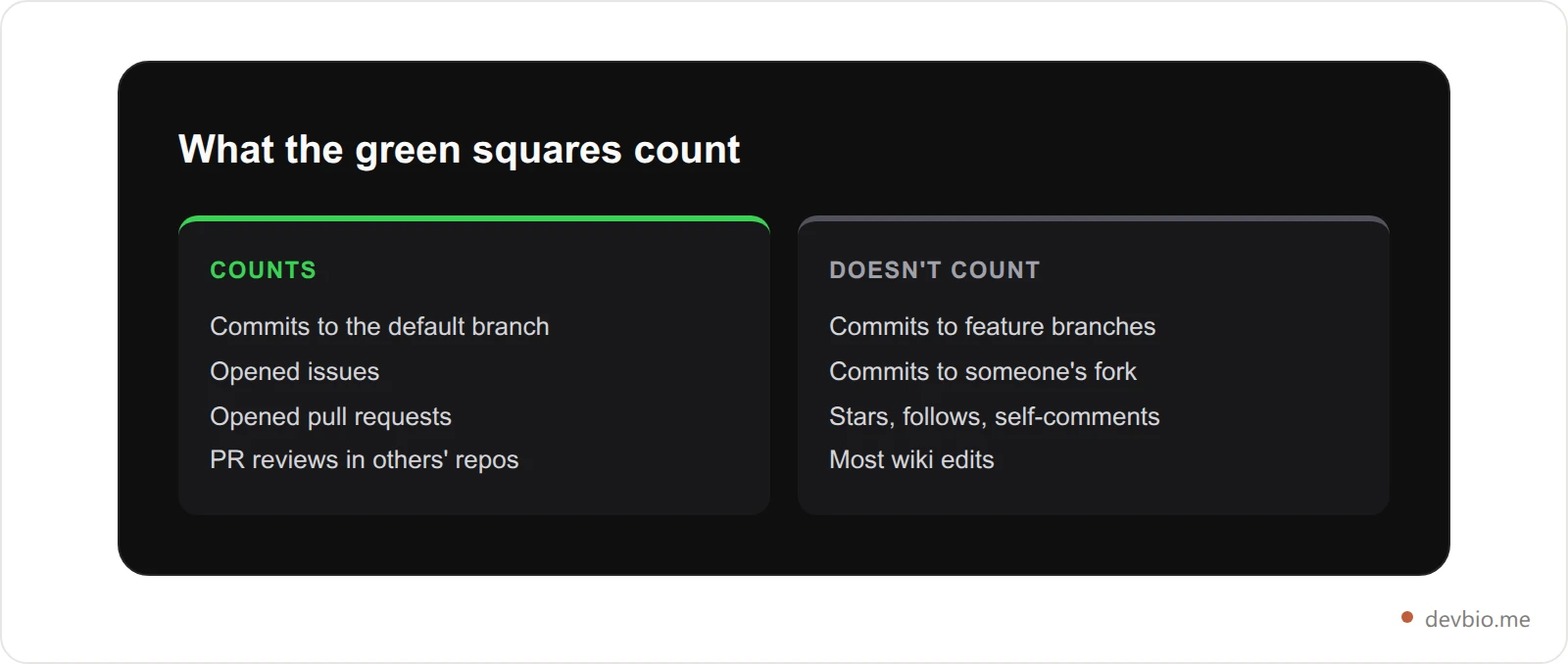
This matters more than most developers realize. If you work on a feature branch for three weeks and then merge it, only the merge commit shows up on the heatmap. Three weeks of "dark" squares, then one green one — not because you weren't working, but because the branch wasn't main.
The Relative Color Scale#
The color intensity is normalized per developer, not compared globally. GitHub calculates four thresholds based on your own contribution distribution over the past year. If your busiest day had 5 commits, that square turns dark green. If another developer's busiest day had 50 commits, their dark green represents something entirely different.
Two developers with visually identical graphs can have completely different raw output. This is worth knowing because it shapes how others interpret your graph — and how you interpret theirs.
The 365-Day Window and the Email Problem#
The heatmap shows a rolling 12 months. Work from two years ago doesn't appear, even if it was your best work.
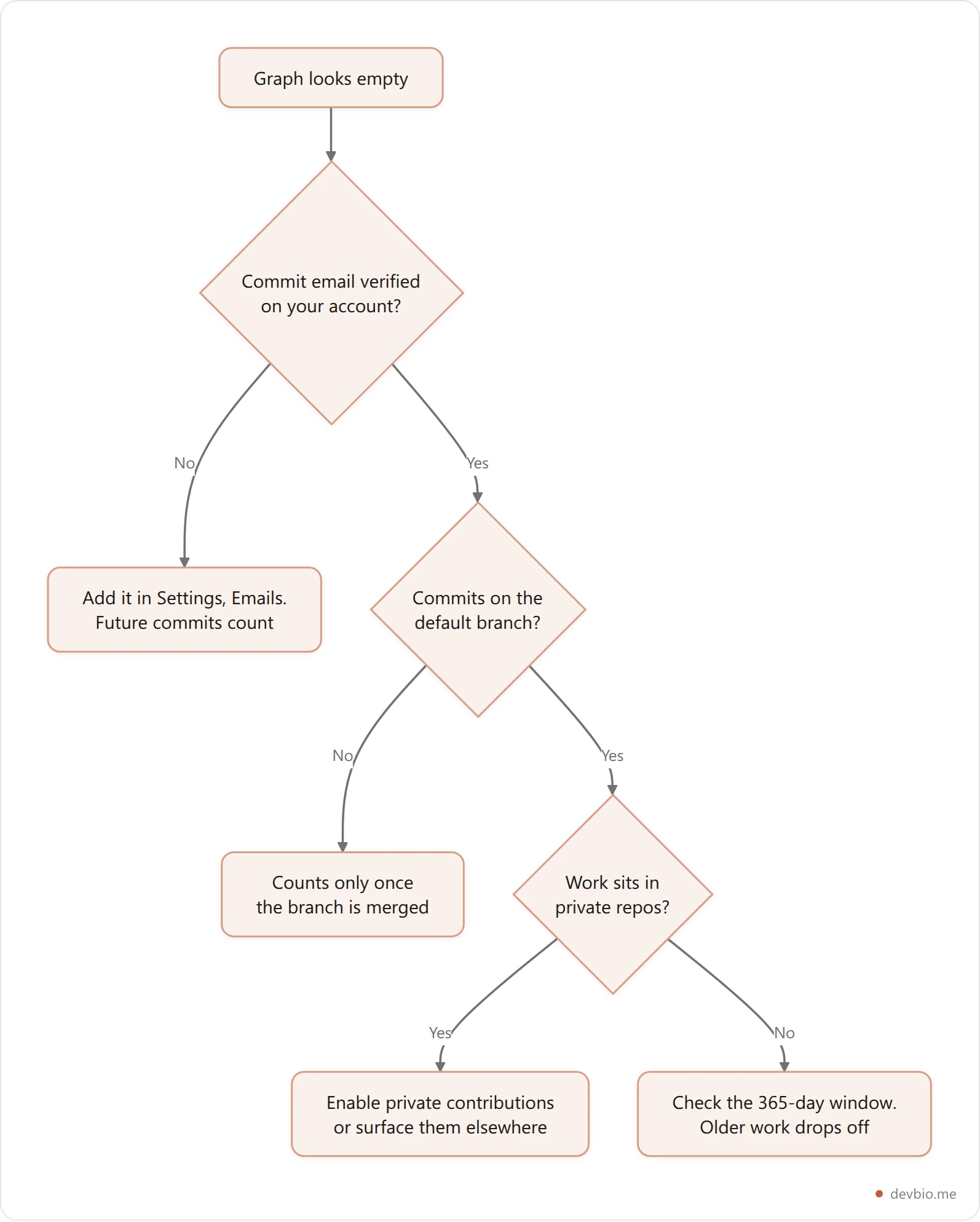
GitHub tracks contributions by email address. Commits made with an email not linked to your account go uncounted. This trips up more developers than it should — months of real professional work become invisible because a work email wasn't added to GitHub Settings → Emails. Adding it retroactively won't recover old commits, but all future commits with that address will count immediately.
If you contribute under multiple emails — personal projects, work repos, open-source organizations — verify each one is listed and verified in your GitHub account settings. It takes two minutes and fixes gaps in your contribution graph right away.
Why the Green Squares Actually Matter to Hiring Managers#
A 2025 industry analysis found that 78% of tech recruiters check GitHub profiles before scheduling interviews (GitHub Recruiting Guide, riem.ai). What they're looking for isn't volume — it's rhythm.
A flat heatmap with one spike raises an obvious question: did this developer build anything consistently, or are they cleaning up a dormant profile for job season? Recruiters who source directly through GitHub have learned to read the shape of the graph. A scattered pattern reads differently than a steady weekly cadence running for eight months straight.
Consistency beats volume. Four or five green squares per week for six months reads stronger than a 30-day sprint followed by nothing. It signals that building is a genuine practice, not a performance for interviews.
As one 2026 developer reflection on Medium put it: the developers with the most compelling contribution history are usually the ones who stopped thinking about the graph. Consistent shipping produces consistent green. Optimizing for the visual tends to produce hollow green.
That said, an empty graph does raise questions — especially for roles that value open-source experience, side projects, or independent work. The goal isn't to game the graph. It's to make sure your real activity actually shows up.
The Private Repository Problem#
Here's the stat that undermines most contribution graphs: roughly 82% of developer activity occurs in private repositories. Enterprise engineers, startup developers, and most freelancers spend the majority of their coding hours in repos the public never sees.

Your public contribution graph reflects the minority of your actual work. You can spend 45 hours a week writing production code and still have a heatmap that looks like you barely touched GitHub.
GitHub gives you one official option: enable private contribution activity in your profile settings. When you turn it on, the graph shows your private commit activity but anonymizes all repository names. For most developers, it's a reasonable trade-off — it produces a far more accurate picture of real output.
The catch: it's all-or-nothing. You can't selectively show private contributions from personal projects while hiding work repos. If your employer has disclosure policies, check those before enabling it.
This is part of why the contribution graph, however useful, is a compressed signal. For a fuller picture you need more context: the projects you've been building, the repos pulling real stars, the revenue numbers on things you shipped. The heatmap is one signal. It shouldn't carry the whole story alone. Add the missing signal to your profile in about two minutes.
For a full breakdown of which profile components carry the most weight, see the guide to developer bio components that actually matter.
The Contribution Visibility Gap#
Here's the problem that almost never gets discussed: even if your contribution graph is healthy, active, and shows a full year of green — it lives only at github.com/yourusername.
When you share a link-in-bio, drop your portfolio URL in a job application, or send someone to yourname.dev, none of that GitHub data travels with you. If you're still choosing that link in the first place, we compared the main Linktree alternatives by what each one actually proves. A recruiter who clicks your bio link sees your skills and project descriptions. Your contribution history stays behind on GitHub, one extra click away that many visitors won't take.
That's the Contribution Visibility Gap: your most credible signal of consistent work is siloed on a platform while the link you share everywhere shows nothing.
Developers have tried to close this gap three ways — each with real limits:
Option 1: GitHub Profile README badges github-readme-stats, streak-stats, and similar SVG widgets drop into your README.md and refresh when someone loads your GitHub profile page. The problem: they only live at github.com/yourname. Share your portfolio link and they're invisible. They also depend on third-party servers staying up, and several popular ones have had extended downtime. If you're also optimizing your GitHub profile README itself, the complete GitHub profile README guide covers what else belongs there. For real examples of profiles that get this balance right, see ten GitHub profile README examples that actually work in 2026.
Option 2: GitHub Actions metrics embed A scheduled GitHub Action regenerates a stats SVG on a cron schedule and commits it back to your profile repo. More accurate and automatable, but the output is a static image — no tooltips, no hover data. It requires personal access token setup and YAML config. And it still lives inside your GitHub profile README, not your developer bio or custom domain.
Option 3: Embed a live heatmap on your developer bio Connect your GitHub account to a platform that syncs the contribution data and renders it as a live, interactive component on your bio page — the link you actually share everywhere.
Comparison: Ways to Show Your GitHub Contribution Graph#
Method | Where it lives | Interactive | Private repos | Setup time |
|---|---|---|---|---|
GitHub.com native | github.com only | Yes, with tooltips | Optional (anonymized) | None |
README badge (readme-stats) | GitHub README only | No | No | 5–10 min |
GitHub Actions metrics | GitHub README only | No | With PAT setup | 30–60 min |
DevBio heatmap component | Your bio + custom domain | Yes, with tooltips | Yes (Pro, repo scope) | 2 min |
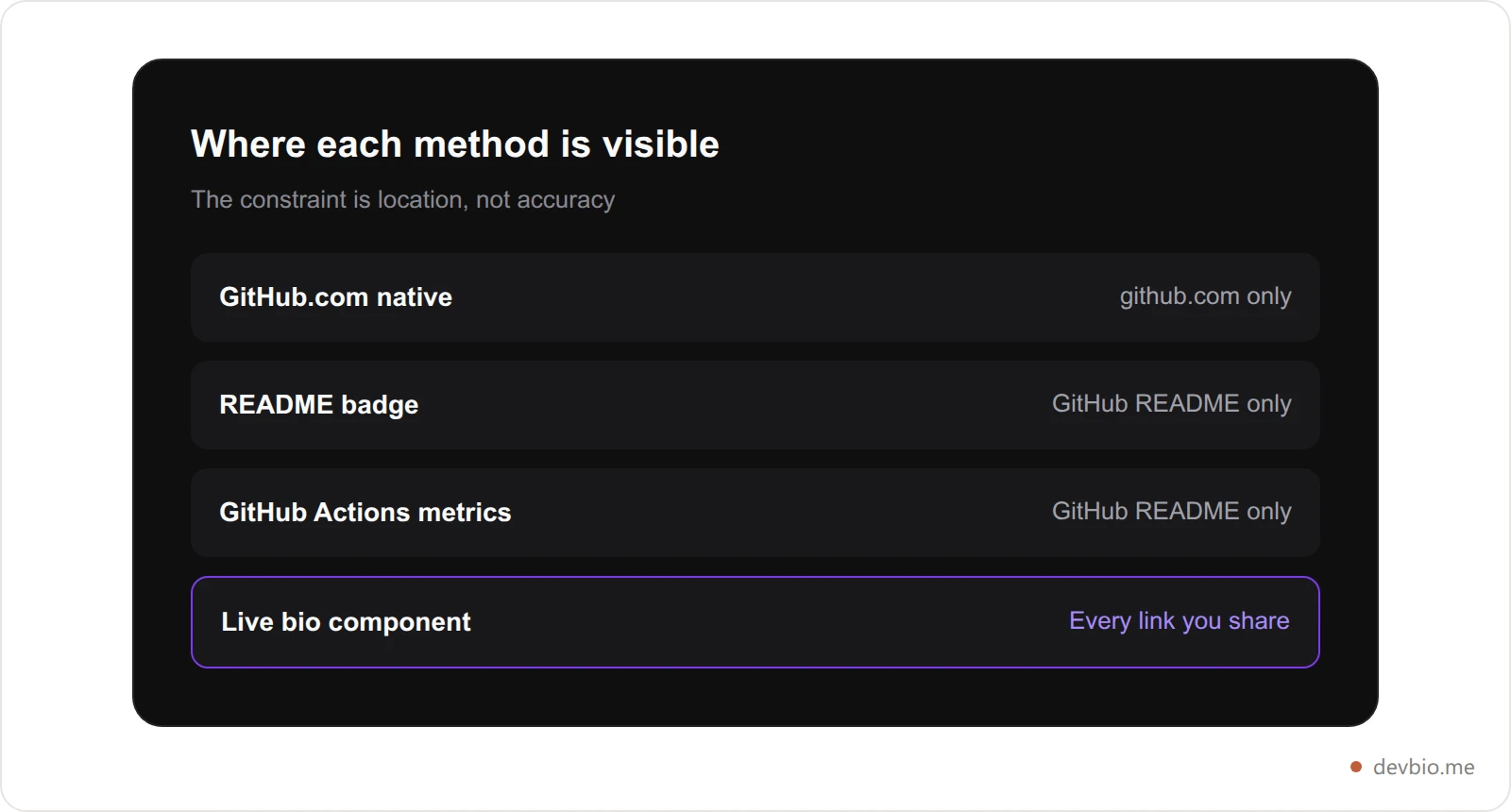
The first three methods share the same constraint: the data stays on GitHub. The fourth brings it to the link you share. See the heatmap component in action.
How DevBio's Contribution Heatmap Component Works#
DevBio's contribution heatmap is a composable bio component that syncs your 365-day GitHub activity via the GitHub GraphQL API and renders it as a live, interactive, GitHub-style contribution heatmap on your developer profile — at devbio.me/yourname or your own custom domain.
What it renders:
Heading:   "Contributions"        (customizable, max 40 chars)
Stats row:  total contributions  |  current streak  |  longest streak
Grid:       52 weeks × 7 days = 364 squares
            5 intensity levels (0–4), matching GitHub's color scheme exactly
            tooltip on each cell: date + contribution count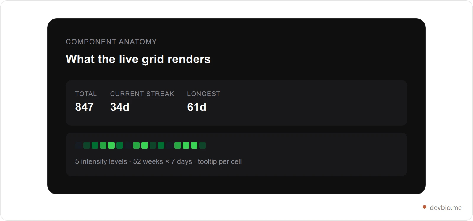
Data is fetched from GitHub's GraphQL API and stored in a dedicated snapshot collection, separate from your profile document — so syncing never invalidates your published bio. On the Pro plan, the heatmap refreshes hourly. The component is Pro-only.
One thing that separates it from README badge options: with Pro, you authorize DevBio with GitHub's repo scope, which means the heatmap reflects your full activity — public and private. The grid shows what you actually built, not just the public subset that github.com displays by default.
The heatmap component is also reused on the DevBio marketplace. If you list a project for sale or acquisition, buyers see your contribution history directly on the listing page — proof the codebase is actively maintained, right next to the revenue chart. If you're thinking about that angle, the guide to how to sell your SaaS side project walks through the full listing process.
Before and After: What a Profile Looks Like#
Without a contribution heatmap on your profile: A hiring manager visits devbio.me/alex. They see a bio, a skills list, and a project card showing 412 GitHub stars. They can see the project exists. They can't see whether Alex has touched it in six months. They click away, or they go to GitHub to check — another redirect, another step they might not take.
With a contribution heatmap: Same profile. Below the projects section, there's a full 52-week activity grid. Current streak: 34 days. Total contributions over the past year: 847. They hover over any square and see the exact date and count. No extra click, no GitHub redirect. The signal is in the same view as the project cards and the live revenue data.
The question shifts from "does this developer have GitHub projects?" to "this developer has been shipping consistently for nearly a year, here are the numbers."
How to Build a GitHub-Style Contribution Heatmap#
Wanting a github style contribution heatmap on your own site is a different problem from showing the one on your GitHub profile. You need two pieces: a data source and a renderer. GitHub supplies the first, a small charting library handles the second, and the data source is where most people get stuck.
Contribution counts are not exposed through the REST API. The supported source is the GraphQL contributionsCollection object, which returns a day-by-day array for a given window — the same numbers that draw the squares on your profile. GitHub's GraphQL reference documents the fields, and the query needs an authenticated token even for public data.
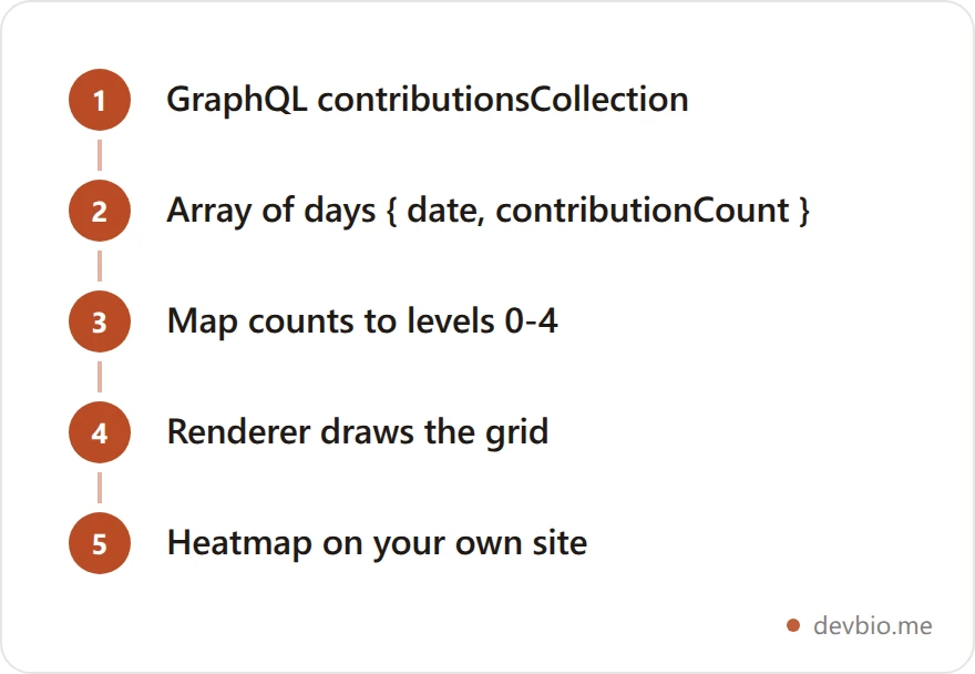
For the rendering step, two libraries cover most cases:
react-activity-calendar — a React component that takes an array of
{ date, count, level }objects. Version 3.2.1 was published in July 2026, so it is actively maintained.cal-heatmap — framework-agnostic and more configurable. Worth knowing that version 4.2.4 was last published in March 2024; it still works, but the project has been quiet for a while.
There is one trap specific to rebuilding the graph yourself, and it is the same relative-scale problem described above. Both libraries expect you to decide which counts map to which shade. If you compute those thresholds from the data you happen to be displaying, a quiet year renders just as green as a busy one, because the darkest square simply means "your personal maximum." Pin the thresholds to fixed counts if you want two different years to be honestly comparable.
How to Add the Heatmap to Your Developer Profile#
The setup takes about two minutes on Pro:
Start your DevBio Pro trial at devbio.me — the 7-day trial includes everything.
Go to Integrations. Connect your GitHub account. Select the
reposcope to include private contributions in the count.Open the component picker on your bio editor. Add the Contribution Heatmap component.
Customize the heading if you want — the default is "Contributions" and it works fine.
Publish your bio. The first sync starts immediately. Full 365-day data appears within a few minutes.
Your heatmap is now live, syncing hourly, at every link you share — your devbio.me URL, your custom domain, or any link-in-bio you use. It updates without any action from you.
If you're also setting up a custom domain, the 10-minute custom domain guide covers the CNAME and DNS configuration from start to finish.
The Compounding Signal: Heatmap + GitHub Stats + Live Projects#
The contribution heatmap is most powerful when it's not the only live data on your profile.
A heatmap showing 600 contributions over the past year immediately raises a follow-up question: what were you building? Project cards that pull live GitHub stars, open issues, and commit counts answer it. If one of those projects also shows verified live MRR from Stripe or Polar, the picture is complete: consistent builder, real shipped output, verifiable revenue.
This is what "proof over claims" means in practice — a principle at the heart of the 4-layer developer personal brand playbook. Instead of listing technologies you know, you show — live and verified — what you've shipped and that you're still shipping. The heatmap handles the when and how consistently. The project cards and revenue data handle the what and the so what.
2025 CoderPad research on technical hiring found that technical assessments are up 48% globally compared to mid-2023. Candidates are being scrutinized more rigorously — by both human reviewers and AI screening tools. A structured profile that surfaces consistent activity, real projects, and verifiable outcomes removes ambiguity from the equation.
For developers building in public, the heatmap is also a social proof layer. When you post your profile link at launch, the grid shows the 90-day build-up behind the product. That's a story your GitHub tells — finally somewhere people can see it without clicking away. The guide to building in public with live data covers the full setup if you're going that route.
Frequently Asked Questions#
What is the GitHub contribution heatmap?#
The GitHub contribution heatmap — also called the contribution graph or "green squares" — is a 52-week calendar grid on your GitHub profile that shows how many qualifying contributions you made each day over the past year. Qualifying contributions include commits to default branches, opened issues, opened or reviewed pull requests, and code reviews in repos you don't own. Color intensity increases with activity, using a scale relative to your own history rather than any global developer average.
Does the contribution graph show private repository activity?#
Not by default. GitHub's public graph only shows activity from public repositories. You can enable private contributions in GitHub profile settings, which shows the activity counts but anonymizes all repository names. Platforms like DevBio that authorize with the GitHub repo scope can display your full contribution count — public and private — on your developer bio, without changing any GitHub-side privacy settings.
Why does my contribution graph look empty even though I code every day?#
The most common cause: your commits use a work or school email address that isn't linked to your GitHub account. GitHub only counts commits whose author email matches a verified address on your account. Go to GitHub Settings → Emails and add your work email. Also check that your commits are going to the default branch — work on feature branches only counts when those branches are merged to main.
Do contribution streaks matter to employers?#
Consistency matters more than streak length. A steady pattern of weekly activity over several months reads stronger than a pre-interview sprint. Hiring managers use the graph as a first-pass signal of genuine engagement with coding — not a precise measure of skill. An empty graph raises questions; a padded one made of trivial commits raises different ones. Real work at a real cadence is the goal, not the visual.
Can I embed my GitHub contribution graph on my portfolio or custom domain?#
Yes, with the right platform. README badge widgets like github-readme-stats only appear on your GitHub profile page and aren't visible from any other link you share. For your developer bio or custom domain, you need a platform that fetches your contribution data live — DevBio's contribution heatmap component does this, syncing hourly and rendering a pixel-accurate interactive grid on the link you actually hand out.
What's the difference between GitHub's native graph and DevBio's heatmap component?#
GitHub's native graph lives at github.com and is visible when someone visits your GitHub profile directly. DevBio's heatmap component pulls the same underlying data via the GitHub GraphQL API and renders it on your developer bio at your custom domain or devbio.me URL — the link you share in job applications, on Twitter, in your email signature, everywhere. It also surfaces streak stats, supports private repo activity with repo-scope authorization, and syncs hourly without any manual action.
Does the heatmap color scale compare me to other developers?#
No. The color scale is relative to your own contribution distribution, not any global average. Your darkest green square represents your personal maximum output day. This makes direct cross-profile comparisons unreliable by design — which is one reason hiring managers who know what they're doing focus on the pattern (consistency, cadence, recent activity) rather than trying to read absolute values from the color alone.
Should I enable private contributions on my GitHub profile?#
If most of your real work is in private repos, enabling it produces a much more accurate public representation of your activity. The trade-off: all private contribution activity becomes visible (with repo names anonymized), and you can't selectively show some while hiding others. Check your employer's disclosure policies before enabling it. If privacy is a concern, DevBio's heatmap component handles this differently — it feeds activity data directly to your bio without modifying any GitHub privacy setting.
Key Takeaways#
Your GitHub contribution heatmap is one of the clearest signals you can show about your work habits — but only when it's visible in the right place.
Three things worth keeping: one, the green squares only show public activity by default, and roughly 82% of real developer work happens in private repos. Two, even a healthy heatmap is stranded on github.com unless you bring it to the link you actually share. Three, consistency over months outweighs any single streak number — the graph rewards the genuine habit, not the interview sprint.
Put your contribution history where hiring managers, clients, and collaborators will actually see it — right next to the projects it represents and the revenue data that proves they shipped.
Your code already proves you can build. Put it on one link — devbio.me.


